Wanna help again?
Your input was so valuable on the Double Blind cover, we decided to put you smart people to work again.
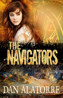
I always liked the original cover for The Navigators, but maybe we can do better.
Which cover screams time travel adventure to you?
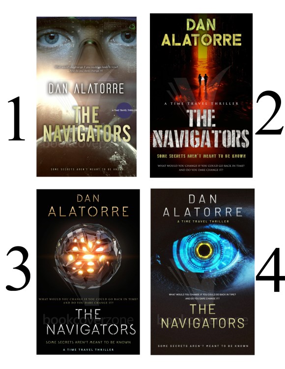
Or should we stick with the original cover, below:
Make your selection and comment below.
(Please let me know what you usually read and/or if you read science fiction, particularly time travel stories. This one is a fast-paced adventure.)
Thanks!
Buy The Navigators paperback (with the old cover and still with cuss words for now) for $12.99 or get the eBook (also with the old cover but NO cuss words) for $2.99.
They both make great Christmas presents, by the way!

29 replies on “Help me pick a new cover for The Navigators!”
Love the original but all cool options
LikeLiked by 1 person
Thanks, Beth!
LikeLike
#2 Dan.
LikeLiked by 1 person
Cool. Thank you.
LikeLiked by 1 person
Two is definitely my first choice. Should catch the eye of both gender buyers and ‘feels’ more adventuresome than the others.
One is my second but I think would draw more women and feels more ‘cerebral/mystical’
~C
LikeLiked by 1 person
Thanks, Claire!
LikeLike
#2 was my first choice with #3 a close second. I wonder,too, is there too much text for the front? For me, one strap line – the shorter one about secrets – is sufficient. The thing abut “What would you change . ..” is pretty much illegible on a thumbnail anyway and would do better at the top of the back page.
LikeLiked by 1 person
Good input!
Yeah, you can’t see that fine print on the thumbnail, but if you click the thumbnail you need to have a little bit more information to get them to read the blurb. The blurb needs to get them to click “buy.“
So it all interrelates, but without an eye-catching cover, the rest doesn’t matter too much.
LikeLike
#2 is by far my first choice. Love the colours and like the small people. They are a real interest factor for me.
LikeLiked by 1 person
Awesome! Thank you for your input!
LikeLiked by 1 person
I like the original cover, and I also like #1. Those human eyes really get to me! I love time travel stores and Sci-fi.
LikeLiked by 1 person
Really! That makes your input even more valuable. How about this. Check out the last handful of time travel sci-fi books you read it and see what their covers look like. Any trends?
LikeLiked by 1 person
Actually, a lot of them do have clocks, and pictures or faces of the characters on the covers 🙂
LikeLiked by 1 person
Yeah, I saw that. But in the top 25 I didn’t see enough to say it was a standard of the genre. It makes sense if they had them but I didn’t see a lot of it.
LikeLiked by 1 person
I also prefer #2. I’m not drawn to books that clearly show a person’s face (unless it’s an actor from a movie version:). I like the movement and excitement in this cover without showing the people in close-up.
LikeLiked by 1 person
Last time we did this, I had half a dozen people make that same comment about faces. And we have seen it time and time again in articles we researched. So I really appreciate that input.
And thank you very much for voting!
LikeLiked by 1 person
I think No. 3 is ‘classy,’ while No. 4 is striking colour-wise.
Good luck with it!
LikeLiked by 1 person
It definitely is. Thanks for the input!
LikeLike
They’re all great, Dan. Are you the the cover artist? I’m leaning toward #4- the eye draws you in and the blue speaks to space. Good luck!
LikeLiked by 1 person
No, I did not design any of the four new ones. I had some input on the original but someone else designed that, too.
LikeLiked by 1 person
It’s not a space story, though. It’s a time travel story.
LikeLiked by 1 person
I like 2, 3, and 4.
LikeLiked by 1 person
In that order?
LikeLiked by 1 person
No I think I like 3 best. But they are all good
LikeLiked by 1 person
Thanks!
LikeLiked by 1 person
I would be inclined to go for cover 1
LikeLiked by 1 person
Thank you!
LikeLike
No 4 just wowed me.
LikeLiked by 1 person
Cool. Thanks!
LikeLike