
Along the way of making an awesome book, you have to make or buy an awesome book cover.
Or three…
The eBook cover is the easiest, at least to me. Rectangle, taller than it is wide. Pretty straightforward.
The paperback isn’t much harder – still a vertical rectangle – but you have a book spine to consider, and also a back cover. Which means you have to think up other stuff to put in that space.
Still not hard, really, but there are additional decisions to make.
Decisions, decisions…
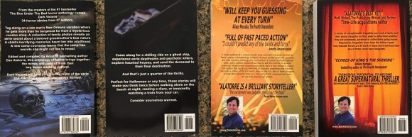
I use the back cover of the paperback to sell the book. Usually, a person is holding it at an event (and I am telling them how awesome it is). If they buy the book online, they may never see the back cover, but they might, so its job is still to sell the book.
I do this by:
- Having a few nice reviews on the back cover. People feel more secure doing what other people are doing, and the reviews say other people are reading and
likingloving this book. - Then I have a short description – a blurb – that is also designed to entice them to buy, and then
- If I wrote the book, there’s a nice friendly picture of me.
Even if you are butt ugly like Stephen King or George RR Martin, I’d still use an author pic. To me, it’s part of branding. In my case, often someone just heard me give an awesome presentation and now wants to capture some of that awesomeness in book form, to see how I actually write the stuff I just told them about.
The pic says, this was that awesome presenter guy. Cuts down on confusion. They stared at ME for an hour, not my name. Make things easy on them.


More decisions! What picture of me do I go with?
Or do I use a picture of me at all?
The pic on the left is my old friendly me; the one on the right is the new(er) pic of friendly me. Of course, friendly me is usually standing in front of them, too. Telling them how awesome the book is.
Then you have the fun of an audio book cover. (And if you get the book translated, you have the extra fun of making titles in different languages. Woo hoo!)
The audio book is tricky because we spend so much time working on a vertical rectangle for an eBook/ paperback,
we can hit a wall when we have to now make that into a square.
I mean, why’s it gotta be square, ACX?
But it does.
Which means all those cool images you reviewed for the vertical rectangle eBook and paperback, now need to be considered for squares.
It’s not super hard, but it is different. I like that the audio book and eBook look different, but it’s a pain in the rear to do. You can’t just crop the rectangle into a square (ACX rules say that’s a no no and they won’t approve it), and you need it to look professional, so you have to spend a little time on it.
Here’s the result for Dark Visions, our latest horror anthology (soon to be available in audio book). have you been listening to the narrated story samples I’ve been posting? Good stuff.


Compare the eBook/paperback version of the cover to the audio book version on the right.
Almost the same, but not quite. A little more visual information in the audio book cover. Enough to say, “This is the same book, but this is the audio version.”
Which is what you want. Provide your book in the format the buyer wants.
That makes you awesome.

3 replies on “ACX Audio Book Cover, A Semi-Tutorial”
This is a very helpful post, Dan. I have never put my picture on the covers of my books. I will change that going forward.
LikeLiked by 1 person
Thanks!
LikeLiked by 1 person
Reblogged this on When Angels Fly.
LikeLiked by 1 person