
This should only take a minute.
It’s the big launch weekend for my newest book, Poggibonsi, an Italian misadventure, so I’m making some ads.
Fun stuff, right? Well, you need to learn this too, so pay attention.
Please scroll through these mock-ups and tell me if any strike your fancy.
You can buy Poggi this weekend for just 99 cents, then the price goes up – so act fast! But today I need input on what ads to run to catch other people’s eyes
You’re not going to offend anybody; just say, “I like Annette’s ad,” or “I don’t like Curtis’ one.”
If you say, “Screw the ads, I hated this book!” …we probably can’t be friends anymore.
Also, you can say, “I like the color of this one with that one’s words/layout/something. Any feedback is helpful. These folks didn’t make the ads, so they won’t be upset if you don’t like the ads. Probably.
Oh, and you might notice – I try to use YOUR Ammy review. If you are an author, I like to make ads that mention YOUR BOOK title!
Just another perk of being a loyal reader of the blog. Does Stephen King do that for you? No, he does not.
YOUR NAME AND BOOK TITLE in MY national advertising campaign. Because you guys rock and I like to help my friends. (So if you were thinking about doing a review…)
Okay. Get to work and look over these ads:
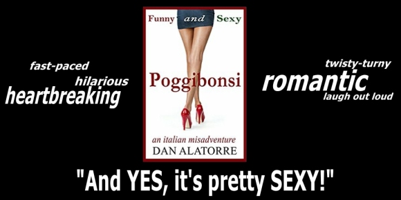
ABOVE: “Pretty sexy” ad with quotes from Anne Marie (we will stick her name in there on the final version)
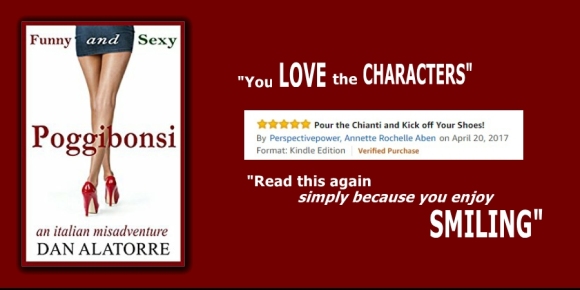
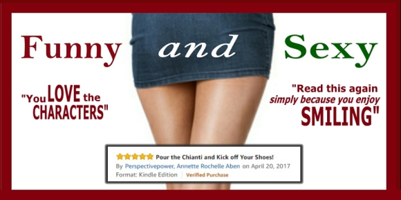
ABOVE: “love the characters” ad featuring Annette Rochelle Aben’s Amazon review
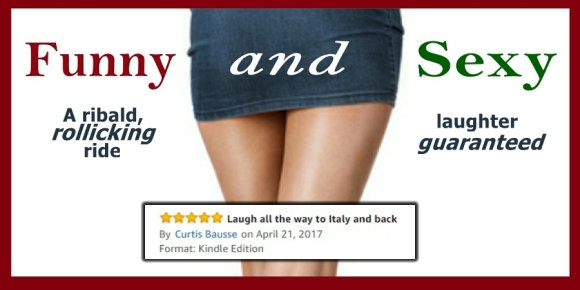
ABOVE: “Funny and Sexy” ad featuring Curtis Bausse’s Amazon review
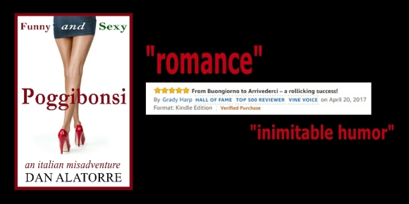
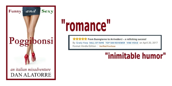
ABOVE” “Romance black background” ad featuring Amazon Top Reviewer Grady Harp’s review
ABOVE” “Romance white background” ad featuring Amazon Top Reviewer Grady Harp’s review
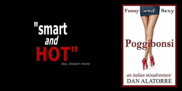
ABOVE” “Smart and HOT” ad featuring Jess’ Ammy review. (Say the word, Jess, and you’ll have your full name and book title. I didn’t do it because it wasn’t on Ammy that way and I always want to get permission first.)
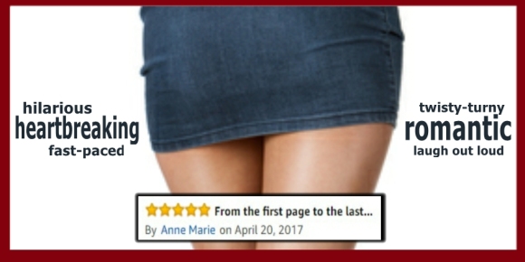
ABOVE: “Skirt Anne Marie” featuring Anne Marie’s review
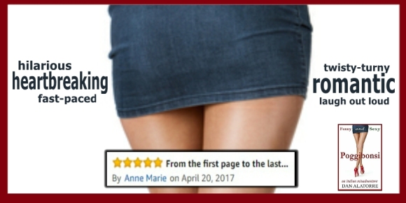
ABOVE: same ad with the book inserted. “Skirt + Book Anne Marie” featuring Anne Marie’s review
ABOVE: again, the same ad with different font colors “Skirt + Colored fonts Anne Marie” featuring Anne Marie’s review
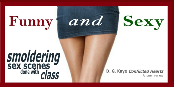
ABOVE: “Skirt DG Kaye” featuring Debby’s book title Conflicted Hearts. This adds credibility to the ad and also gets Debby some pub.
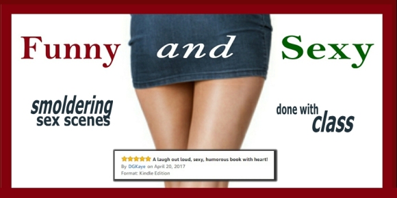
ABOVE: “Skirt DG Kaye + Review box” featuring Debby’s actual Ammy review headline
That’s it!
Give me YOUR thoughts!
Thanks in advance!
New Authors: asking for the opinion of fans and friends will save you LOTS of money on bad ads. The key is, you have to tell them to be honest and you have to accept their input. Post stuff like this on your blog, Facebook page, and Twitter, and after about 10-20 votes a clear winner emerges every time. 100 votes later, the winner will still be the same, so tons of followers aren’t necessary – and you save $$$ posting better ads than if you did this alone.
Please share this with your friends and reblog it! I want all the input I can get!
Dan Alatorre is the author of several bestsellers and the hilarious novel “Poggibonsi: an italian misadventure.”
Click HERE to get your copy of the funniest, sexiest book you’ll read this year!

28 replies on “Help me pick some ads!”
Here are my thoughts: take them with a grain of salt.
I like “Pretty Sexy” and “Smart and HOT”. The black background grabs my attentions and it stands out a bit more. Skirt DG Kaye is also ok. I like the font and the layout.
The rest all have the same thing that bugs me: the box with the Amazon review. I don’t like the way that looks. It seems very amateurish, as if someone just plunked a text box in the middle of the ad.
LikeLiked by 1 person
That’s pretty much what I did. I guess we can change that.
Great in put! Thanks!
LikeLike
I like the Jess in black… just as is. Of course I liked mine, the first one. Good luck with this, you have some good stuff from which to choose.
LikeLiked by 2 people
And more coming every day!
I liked the “Jess” one, too. Simple but effective.
LikeLiked by 1 person
“Smart and HOT” for sure!
LikeLiked by 1 person
Yeah. Hard to dislike that one!
LikeLiked by 1 person
I like the red, like the full cover, agree the amazon text box thing is not appealing, like the words from Curtis’s review.
LikeLiked by 1 person
You know, I put those Amazon boxes in there to show people they were actual reviews. I suppose that’s just as effective without the box – the box does tend to look kind of homemade/amateur. I never thought that before but I think it now! You guys are invaluable in the information you provide. If you think that, lots of other people do, too.
LikeLiked by 2 people
I like the DJ Kaye one the best. But they are all good. How much do you charge to create ads? My second will be published soon and I would like to get that, as well as my debut some more notice. 🙂
LikeLiked by 1 person
I meant. DG. Not DJ. Lol oops. 😛
LikeLiked by 2 people
We knew what you meant.
LikeLike
Charge??? I am making mock ups that I sent out to my friends and whatever ones get the most votes is what I use. I don’t know how you would charge for that!
LikeLike
I probably read what you wrote at the top wrong. 🙂 Long, stressful day for me and I can’t focus. Lol
LikeLiked by 1 person
No worries. I was flattered!
LikeLike
I don’t care for the box on the girl’s legs. It cuts up the shape of her legs which is the best thing about the cover. The content of the comments look fine.
LikeLiked by 2 people
Sweet! Thanks!
LikeLike
My take on it.. Use first ad but replace bottom line with
Smart and Pretty Sexy !
(In italics with same letter case, I can’t do italics 😕
Then I think it will have all the eye and mind candy without being too “busy”
Hope sales exceed your expectations 😊
LikeLiked by 1 person
It is so far! Thanks!
LikeLiked by 1 person
If this is for Facebook, the black one without Amazon text box screenshots works for me. Everything else has too much text and takes away from the image.
LikeLiked by 1 person
That’s an awesome insight. Thank you.
LikeLike
I forgot you have 2 black ones. The one with less text and says smart and hot is what I think would catch the reader’s eye more.
LikeLiked by 1 person
Cool. Thanks.
LikeLike
I like all these!
I think the black one on top jumps out at me the most, and I agree with Annette that the sexy legs are too perfect to block. 🙂
LikeLiked by 1 person
Ha! Okay.
LikeLiked by 1 person
These are nice. I like the “Skirt DG Kaye” featuring Debby’s book title Conflicted Hearts.
LikeLiked by 1 person
Hey, we need one featuring you, book blogger! How do I make that happen???
LikeLiked by 1 person
Ooh. Tempting. We do, don’t we…I’ll email you the details of registering your book to my list. That way we don’t make the people in front of you jealous 😉.
LikeLiked by 1 person
Perfect. Can’t wait. Thanks.
LikeLiked by 1 person